The Psychology of Finishes & Colors in Interiors
- psdsinterior
- Sep 9, 2025
- 4 min read

When we walk into a room, our senses immediately begin decoding the environment: the colors on the walls, the shine on the furniture, the softness of textures. These aren’t just visual impressions—they shape our mood, perception, and even the way we behave. This is the fascinating realm of the psychology of finishes and colors in interiors.
For homeowners, clients, and even professionals, understanding this psychology is vital. A poorly chosen finish can make a luxurious home feel cold, while the right shade in the right finish can instantly uplift a space. Let’s dive deep into how colors and finishes influence interiors, with both design and manufacturing insights.
🎨 The Psychology of Color in Interiors
Colors have always been tied to emotion and perception. In interiors, they dictate more than beauty—they affect comfort, productivity, intimacy, and energy.
1. Warm Colors (Reds, Oranges, Yellows)
Psychological effect: Stimulating, energizing, welcoming.
Where to use: Dining rooms (to encourage appetite), living areas (to spark conversations).
Caution: Overuse can feel overwhelming. Often best balanced with neutrals or wood.
2. Cool Colors (Blues, Greens, Purples)
Psychological effect: Calming, focused, serene.
Where to use: Bedrooms, offices, spa-like bathrooms.
Cultural note: In India, green often connects to prosperity and peace, while blue can signify vastness (sky, water).
3. Neutral Colors (Whites, Beiges, Greys)
Psychological effect: Clean, timeless, versatile.
Where to use: Almost anywhere. They are the foundation of minimalism and modern luxury.
Design tip: Layering textures in neutrals prevents spaces from feeling sterile.
4. Bold Colors (Black, Deep Jewel Tones)
Psychological effect: Dramatic, luxurious, powerful.
Where to use: Accent walls, statement furniture, trims.
Caution: They shrink visual space—so balance with lighter surroundings.
🪞 The Psychology of Finishes in Interiors
Color may be the first thing you notice, but the finish decides how that color is experienced. Matte, glossy, textured, or metallic—each has a psychological undertone.
1. Matte Finishes
Effect: Subtle, grounded, cozy, reduces glare.
Where to use: Bedrooms, minimal kitchens, walls where calmness is required.
Example: Matte laminates or matte PU give a natural, understated luxury.
2. Glossy Finishes
Effect: Reflective, bright, energetic, feels spacious.
Where to use: Compact spaces (to bounce light), kitchens (for a sleek modern look).
Material insight: Glossy laminates or acrylics often have undulations that catch light unevenly, sometimes leading to distortions. For a more flawless effect, high-gloss PU Paint, Duco Paint, or natural glossy surfaces like glass are superior choices.
3. Textured Finishes
Effect: Tactile, adds depth, earthy, organic.
Where to use: Accent walls, wardrobes, panels, furniture.
Examples: Natural veneer with open grain, fluted MDF panels, fabric-finish laminates.
4. Metallic Finishes
Effect: Luxury, sophistication, boldness.
Where to use: Handles, trims, accents, lighting fixtures.
Examples: Brass, brushed steel, rose gold, copper finishes.
🔍 What Are Undulations?
In simple terms, undulations are tiny waves, ripples, or unevenness on a surface. Imagine looking into a mirror—if it’s perfectly flat, the reflection is sharp and true. But if the mirror has small bends or ripples, the reflection warps. The same principle applies to glossy finishes. When light falls on a surface with undulations, it reflects unevenly, creating distortions and breaking the illusion of smoothness.
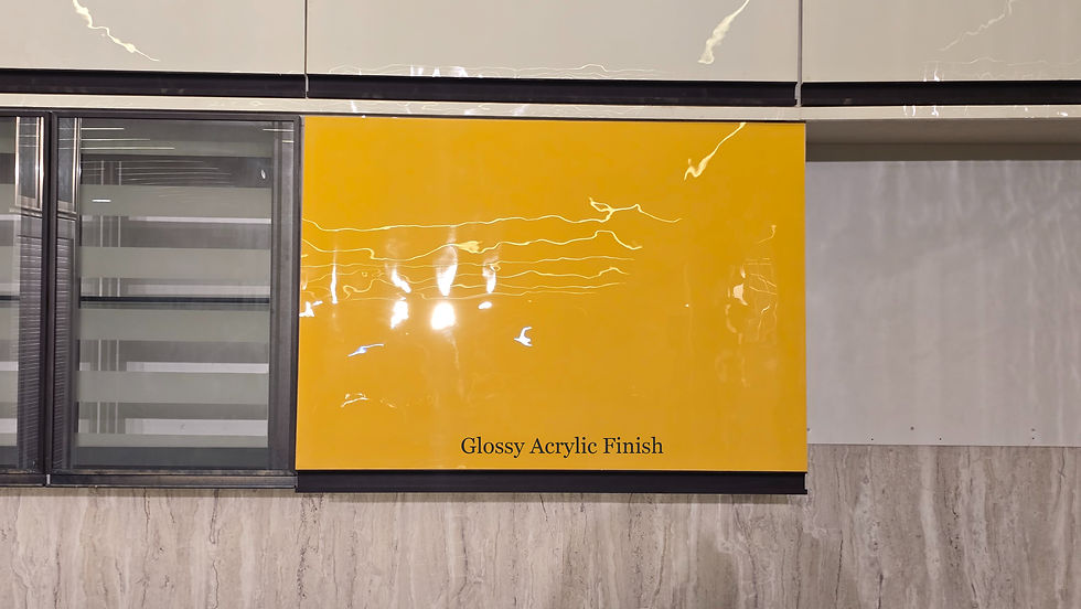

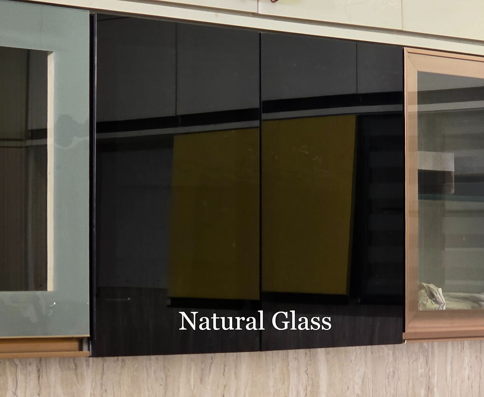
I hope the above images help. Laminates & Acrylic sheets are Man-Made and not natural. Whilst glass is natural occurring element. Please read out the table below on what to prefer.
Finish Type | Surface Undulations | Look & Feel | What is suggested? |
Glossy Laminate | Moderate under lighting | Sleek but not premium | Prefer Matte Finish |
Glossy Acrylic Sheets | Very High Under lighting | Reflective but not premium | Prefer Matte Finish |
PU/Duco Paint | Below Minor undulations | Premium & Luxurious | Both Glossy & Matte can be preferred |
Glass | Zero Undulations | Reflective, Premium & Luxurious | Prefer Glossy Finish |
🔄 When Color Meets Psychology of finishes and colors in interiors
The real magic happens when color psychology blends with the right finish. Some iconic examples:
Matte Black → Chic, mysterious, cozy sophistication (ideal for bold bedrooms or modern kitchens).
Glossy White → Bright, airy, futuristic (often used in compact apartments to make spaces feel larger).
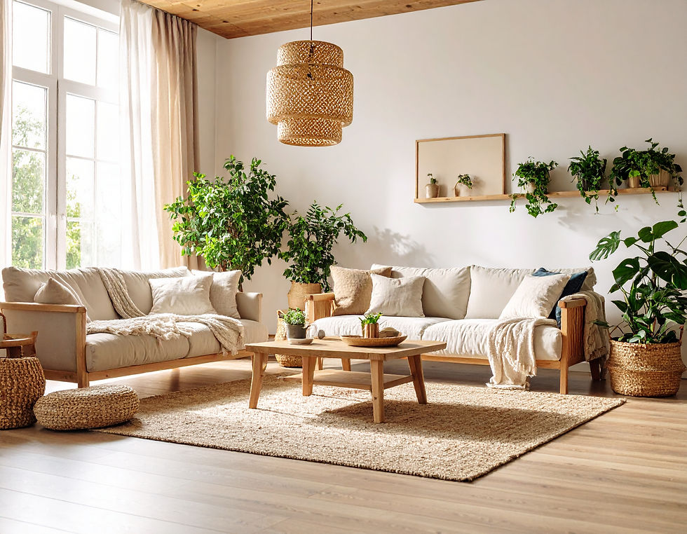
Warm Wood Textures → Timeless, grounding, comfort-driven (perfect for living rooms and bedrooms).
Soft Pastels in Matte → Nurturing, calm, and Scandinavian-inspired minimalism.
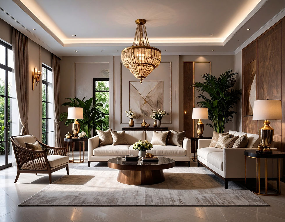
Glass + Neutrals → Transparency, elegance, and openness.
🏡 Real-World Applications
To make this practical, here are tips you can give clients:
Small spaces: Use lighter shades in glossy finishes to reflect light and give an illusion of openness. Example: Glossy white PU kitchen shutters.
Large open rooms: Opt for warm matte tones to add intimacy. Example: Matte beige walls with walnut veneer panels.
Workspaces: Cool matte tones (like muted greens, blues) help concentration. Example: Matte laminate work desks.
Kids’ rooms: Combine playful colors with glossy highlights. Example: Glossy PU yellow storage shutters balanced with matte white walls.
Luxury accents: Use natural glossy materials like glass or metallic trims rather than synthetic high-gloss laminates for a premium touch.
✨ Closing Thought
Finishes and colors aren’t just surface-level decisions—they are emotional triggers that transform how we feel inside our homes and offices. The glossy kitchen you admire every morning might subconsciously energize you. The matte neutral bedroom may be what calms you after a long day. The wood textures in your living room could be the invisible thread grounding you to nature.
So next time you run your hand across a surface or notice how a color makes you pause, remember: that’s psychology in design at work.
If you’re planning your space, don’t just ask “what looks good?”—ask “how will this make me feel?” And always choose the right material for the finish you want—because design beauty is as much about execution as it is about imagination.
Loved what you just read? Let’s make it happen in your space! Contact us and we’ll get started.
Comments